16 Feb CSS3 Continuous Transition – Part I
Learn how to create in minutes a cool responsive animated slide with CSS3 Continuous Transition and other CSS3 animations. With the help of “transform: translate3d” we will replace the impeded and the tedious “background position” in order to get a smooth and continuous movement for our… clouds and, of course, to obtain a responsive behavior. Enjoy this CSS3 Continuous Transition tutorial!
01. Create Your Background Scene
It’s a while since it is not appropriate to use pictures for this. You can get a nice gradient with css styles. Your sky is ready to embrace some clouds now. With border-radius, if you want you can round the corners of the div.
HTML CODE
<body>
    <div class="cloudsBGDBox"></div>
</body>
CSS3 CODE
.cloudsBGDBox {
    position:absolute;
    left:50%;
    top:50%;
    -webkit-transform: translate(-50%, -50%);/* Chrome, Safari, Opera */
    -ms-transform:translate(-50%, -50%);/* IE 9 */
    transform: translate(-50%, -50%);
    z-index:0;
    width: 70%;
    height: 0;
    padding-bottom: 18%;
    overflow:hidden;
    border-radius: 0.7em;
    -moz-border-radius: 0.7em;
    -webkit-border-radius: 0.7em;
    xbackground: #f7adc6;
    background: -webkit-linear-gradient(#009ced, #c4e8fb); /* For Safari 5.1 to 6.0 */
    background: -o-linear-gradient(#009ced, #c4e8fb); /* For Opera 11.1 to 12.0 */
    background: -moz-linear-gradient(#009ced, #c4e8fb); /* For Firefox 3.6 to 15 */
    background: linear-gradient(#009ced, #c4e8fb); /* Standard syntax */
}
Here’s the result. A nice blue sky.
02. Add Some Clouds – how CSS3 Continuous Transition works
Now is time to use pictures. We attach an image as background for each of these two new divs added in html – two group of clouds. For the images we create two nice css3 animations which will be called: “cloudsBGD1” and “cloudsBGD2”. In order that the example be closer to reality for the second animation we will change a little bit the speed of movement.
HTML CODE
<body>
    <div class="cloudsBGDBox">
       <div class="cloudsBGD2"></div>
       <div class="cloudsBGD1"></div>
    </div>
</body>
CSS3 CODE
.cloudsBGD1 {
    z-index:0;
    position:absolute;
    visibility:hidden;
    width:100%;
    height:0;
    padding-bottom: 25.0%;
    left:0%;
    bottom:0%;

    background: url(../images/cool_Clouds1.png);
    background-size: 100%;
    background-repeat: no-repeat;

    transform: translate3d(0,0,0);
    -moz-transform: translate3d(0,0,0);
    -webkit-transform: translate3d(0,0,0);

    -webkit-animation-name: cloudsBGD1;
    -moz-animation-name: cloudsBGD1;
    animation-name: cloudsBGD1;

    -webkit-animation-duration: 52s;
    -moz-animation-duration: 52s;
    animation-duration: 52s;

    -webkit-animation-timing-function: linear;
    -moz-animation-timing-function: linear;
    animation-timing-function: linear;

    -webkit-animation-iteration-count: infinite;
    -moz-animation-iteration-count: infinite;
    animation-iteration-count: infinite;

    -webkit-animation-fill-mode: forwards;
    animation-fill-mode: forwards;
}


@-moz-keyframes cloudsBGD1 {
    0%  { transform: translate3d(0%,0,0); -webkit-transform: translate3d(0%,0,0); visibility:visible;}
    50%  { transform: translate3d(-100%,0,0); -webkit-transform: translate3d(-100%,0,0); visibility:hidden; opacity:1;}
    50.001%  { transform: translate3d(-100%,500%,0); -webkit-transform: translate3d(-100%,500%,0); visibility:hidden;opacity:0; }

    50.002%  { transform: translate3d(100%,0,0); -webkit-transform: translate3d(100%,0,0); visibility:visible; opacity:1; }
    100%  { transform: translate3d(-0.01%,0,0); -webkit-transform: translate3d(-0.01%,0,0);  visibility:visible; opacity:1;}
}

@-webkit-keyframes cloudsBGD1 {
    0%  { transform: translate3d(0%,0,0); -webkit-transform: translate3d(0%,0,0); visibility:visible;}
    50%  { transform: translate3d(-100%,0,0); -webkit-transform: translate3d(-100%,0,0); visibility:hidden; opacity:1;}
    50.001%  { transform: translate3d(-100%,500%,0); -webkit-transform: translate3d(-100%,500%,0); visibility:hidden;opacity:0; }

    50.002%  { transform: translate3d(100%,0,0); -webkit-transform: translate3d(100%,0,0); visibility:visible; opacity:1; }
    100%  { transform: translate3d(-0.01%,0,0); -webkit-transform: translate3d(-0.01%,0,0);  visibility:visible; opacity:1;}
}


.cloudsBGD2 {
    z-index:0;
    position:absolute;
    visibility:hidden;
    width:100%;
    height:0;
    padding-top: 35.0%;
    left:0%;
    top:0%;

    background: url(../images/cool_Clouds2.png);
    background-size: 100%;
    background-repeat: no-repeat;

    transform: translate3d(0,0,0);
    -moz-transform: translate3d(0,0,0);
    -webkit-transform: translate3d(0,0,0);

    -webkit-animation-name: cloudsBGD2;
    -moz-animation-name: cloudsBGD2;
    animation-name: cloudsBGD2;

    -webkit-animation-duration: 45s;
    -moz-animation-duration: 45s;
    animation-duration: 45s;

    -webkit-animation-timing-function: linear;
    -moz-animation-timing-function: linear;
    animation-timing-function: linear;

    -webkit-animation-iteration-count: infinite;
    -moz-animation-iteration-count: infinite;
    animation-iteration-count: infinite;

    -webkit-animation-fill-mode: both;
    animation-fill-mode: both;
}


@-moz-keyframes cloudsBGD2 {
    0%  { transform: translate3d(100%,0,0); -webkit-transform: translate3d(100%,0,0);visibility:visible;opacity:1; }
    50% { transform: translate3d(0%,0,0); -webkit-transform: translate3d(0%,0,0);visibility:visible; opacity:1;}
    99.997%  { transform: translate3d(-100%,0,0); -webkit-transform: translate3d(-100%,0,0);visibility:visible; opacity:1;}
    99.998%  { transform: translate3d(-100%,0,0); -webkit-transform: translate3d(-100%,0,0); visibility:hidden;opacity:0; }
    99.999%  { transform: translate3d(-100%,0,0); -webkit-transform: translate3d(-100%,0,0); visibility:hidden;opacity:0;}
    100%  { transform: translate3d(100%,0,0); -webkit-transform: translate3d(100%,0,0);visibility:hidden;opacity:1;}
}

@-webkit-keyframes cloudsBGD2 {
    0%  { transform: translate3d(100%,0,0); -webkit-transform: translate3d(100%,0,0);visibility:visible;opacity:1; }
    50% { transform: translate3d(0%,0,0); -webkit-transform: translate3d(0%,0,0);visibility:visible; opacity:1;}
    99.997%  { transform: translate3d(-100%,0,0); -webkit-transform: translate3d(-100%,0,0);visibility:visible; opacity:1;}
    99.998%  { transform: translate3d(-100%,0,0); -webkit-transform: translate3d(-100%,0,0); visibility:hidden;opacity:0; }
    99.999%  { transform: translate3d(-100%,0,0); -webkit-transform: translate3d(-100%,0,0); visibility:hidden;opacity:0;}
    100%  { transform: translate3d(100%,0,0); -webkit-transform: translate3d(100%,0,0);visibility:hidden;opacity:1;}
}
Now see your clouds. And they are moving! CSS3 Continuous Transition is a cool thing. You can find something similar here in a crazy perpetuum slider
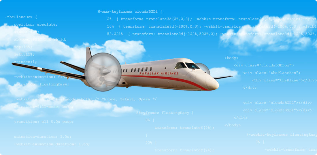
03. To be a little overbearing, we will add a plane
So that the div “thePlane” whom we have attached as a background the image “planeFixed.png” have the exact height, and its feet not go out from the duvet, we need to dress it with another div called “thePlaneBox”. And then need to do some trite calculations: Our image has 632px width and 130px height.
Here the calculations: 130/632=0,2056. Then 0,2056 x 100 = 20,56. So our padding-top for thePlaneBox is 20.56%. We deliberately applied a border to our div for you to see how it will outline its proportions.
HTML CODE
<body>
    <div class="cloudsBGDBox">
        <div class="thePlaneBox">
            <div class="thePlane"></div>
        </div>

        <div class="cloudsBGD2"></div>
        <div class="cloudsBGD1"></div>
    </div>
</body>
CSS3 CODE
.thePlaneBox {
    position: absolute;
    width: 50%;
    top:14%;
    left:11%;
    z-index:1;
}

.thePlaneBox:before {
    content: "";
    display: block;
    padding-top: 20.5696%;
}

.thePlane {
    position: absolute;
    left: 0;
    right: 0;
    top: 0;
    bottom: 0;
    z-index:1;

    background: url(../images/planeFixed.png);
    background-position: 0 0;
    background-repeat: no-repeat;
    background-size: 100%;
}
Let’s see how it looks! Pull the browser to see the responsive behavior and how the height of the div fits the image.
04. The Suitable Propeller
We have to do two more things to give life to our plane with the help of CSS3 Animation. Note again that we preferred to use CSS3 Continuous Transition for moving the clouds, instead of background position. To make the plane flying with our “floatingEasy” CSS3 animation, and to attach to the plane an also animated propeller.
HTML CODE
<body>
    <div class="cloudsBGDBox">
        <div class="thePlaneBox">
            <div class="thePlane"></div>
        </div>

        <div class="thePropellerBox">
            <div class="thePropeller"></div>
        </div>

       <div class="cloudsBGD2"></div>
        <div class="cloudsBGD1"></div>
    </div>
</body>
CSS3 CODE
.thePlaneBox {
    position: absolute;
    width: 50%;
    xborder:#03C 1px solid;
    top:14%;
    left:11%;
    z-index:1;

    -webkit-animation: floatingEasy;
    animation: floatingEasy;

    -webkit-animation-fill-mode: both; /* Chrome, Safari, Opera */
    animation-fill-mode: both;

    transition: all 0.5s ease;

    animation-duration: 1.5s;
    -webkit-animation-duration: 1.5s;

    animation-iteration-count: infinite;
    -webkit-animation-iteration-count: infinite;

    -webkit-backface-visibility: hidden;
    -moz-backface-visibility: hidden;
    -ms-backface-visibility: hidden;
    backface-visibility: hidden;

    -webkit-perspective: 1000;
    -moz-perspective: 1000;
    -ms-perspective: 1000;
    perspective: 1000;
}

@keyframes floatingEasy {
    0% {
        transform: translateY(0%);
    }
    50% {
        transform: translateY(7%);
    }
    100% {
        transform: translateY(0%);
    }
}

@-webkit-keyframes floatingEasy {
    0% {
        -webkit-transform: translateY(0%);
    }
    50% {
        -webkit-transform: translateY(7%);
    }
    100% {
        -webkit-transform: translateY(0%);
    }
}

.thePlaneBox:before {
    content: "";
    display: block;
    padding-top: 20.5696%;
}

.thePlane {
    position: absolute;
    left: 0;
    right: 0;
    top: 0;
    bottom: 0;
    z-index:1;

    background: url(../images/planeFixed.png);
    background-position: 0 0;
    background-repeat: no-repeat;
    background-size: 100%;
}


.thePropellerBox {
    position: absolute;
    width: 8.5%;
    top:20%;
    left:28%;
    z-index:2;

    border: #FF0000 1px solid;

    animation-name: floatingEasy;
    -webkit-animation-name: floatingEasy;

    animation-duration: 1.5s;
    -webkit-animation-duration: 1.5s;

    animation-iteration-count: infinite;
    -webkit-animation-iteration-count: infinite;
}

.thePropellerBox:before {
    content: "";
    display: block;
    padding-top: 100%;
}


.thePropeller {
    position: absolute;
    left: 0;
    right: 0;
    top:0;
    bottom:0;
    z-index:3;
    background-image: url(../images/propellerFixed.png);

    background-repeat: no-repeat;
    background-size:100%;

    -webkit-animation-name: thePropeller;
    animation-name: thePropeller;

    transition: all 0.5s ease;

    animation-duration: 1s;
    -webkit-animation-duration: 1s;

    -webkit-animation-fill-mode: both;
    animation-fill-mode: both;

    -webkit-animation-timing-function:linear;/*ease ease-in ease-out ease-in-out*/
    animation-timing-function:linear;

    -webkit-animation-iteration-count: infinite;/*number|initial|inherit*/
    animation-iteration-count: infinite;
}

@-moz-keyframes thePropeller {
   from { -moz-transform: rotate(0deg); }
   to { -moz-transform: rotate(1440deg); }
}

@-webkit-keyframes thePropeller {
   from { -webkit-transform: rotate(0deg); }
   to { -webkit-transform: rotate(1440deg); }
}

@-o-keyframes thePropeller {
   from { -o-transform: rotate(0deg); }
   to { -o-transform: rotate(1440deg); }
}

@keyframes thePropeller {
   from { transform: rotate(0deg); }
   to { transform: rotate(1440deg); }
}
05. Don’t Forget to Reset Animations
More than likely, after the clouds will travel the width of the slide, when they’ll resume their movement, they will flash a split second. To avoid this annoying and frustrating thing we have to reset the animation with some jQuery functions:
HTML CODE
<!-- RESET ANIMATIONS -->
<script src="http://ajax.googleapis.com/ajax/libs/jquery/1.11.0/jquery.min.js" type="text/javascript"></script>
<script>
    jQuery( window ).resize(function() {
      jQuery('.cloudsBGD1').css({
         '-webkit-animation-name': 'no_animation',
        '-moz-animation-name': 'no_animation',
        'animation-name': 'no_animation'
      });

      jQuery('.cloudsBGD2').css({
         '-webkit-animation-name': 'no_animation',
        '-moz-animation-name': 'no_animation',
        'animation-name': 'no_animation'
      });


  setTimeout(function(){
      jQuery('.cloudsBGD1').css({
         '-webkit-animation-name': 'cloudsBGD1',
        '-moz-animation-name': 'cloudsBGD1',
        'animation-name': 'cloudsBGD1'
      });

      jQuery('.cloudsBGD2').css({
         '-webkit-animation-name': 'cloudsBGD2',
        '-moz-animation-name': 'cloudsBGD2',
        'animation-name': 'cloudsBGD2'
      });

  },10);

});
</script>
That’s all for today folks. You saw CSS3 Continuous Transition – some CSS3 animations in action. See you soon.
Sorry, the comment form is closed at this time.